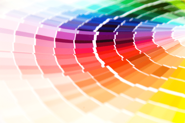
What is your favorite color? Mine is pink. It’s feminine, pretty, and soft, and it makes me feel good. However, I would not want to use pink as a color in my logo and design. Why? Because it does not portray what I want to project for my business. While I feel I personally am all these things, that is not whom I am targeting or what I am as a designer.
Colors invoke feelings and emotions in the viewer. This is at a subconscious level and can make or break a connection with a potential client. For that reason, you need to make sure the color pallet for your logo and brand are on point with the message you want to deliver to your ideal client.
An example of this is the color red. Red can invoke power or love. It can also invoke stress or even anger, especially when mixed with black. For this reason, you would not want to use it for say a spa or massage clinic. You would want to use colors to convey something soothing, healing, or relaxing.
Therefore, it’s important to choose colors that your ideal person can relate to. This way they will be more likely to connect with your message and go from viewer to client. It can also help them to remember you and keep coming back.
